
Typography | Type Specimen Book
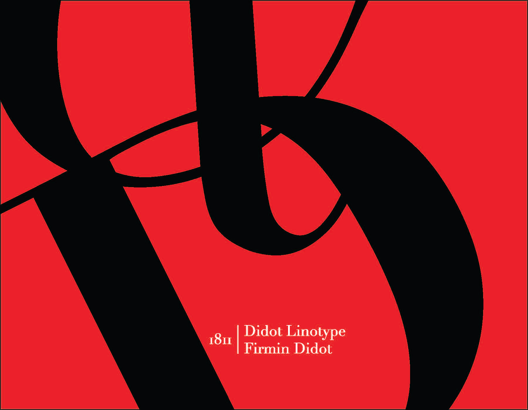
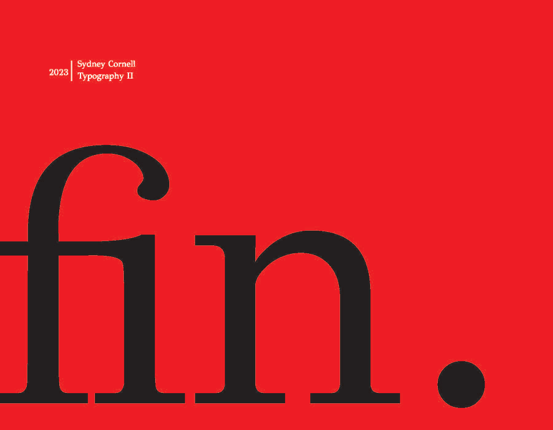
This type specimen book celebrates the elegance and timeless appeal of the Didot typeface through a minimalist red and black design. The book guides the viewer through Didot's history, showcasing its classic forms and sharp contrasts. The layout is visually cohesive, with clean, structured pages that reflect the refinement and sophistication of the typeface itself.


Creative Process – What is your reasoning behind these design choices?
Minimalist Design: I opted for a minimalist red and black color scheme to keep the focus on the Didot typeface while adding visual impact and elegance.
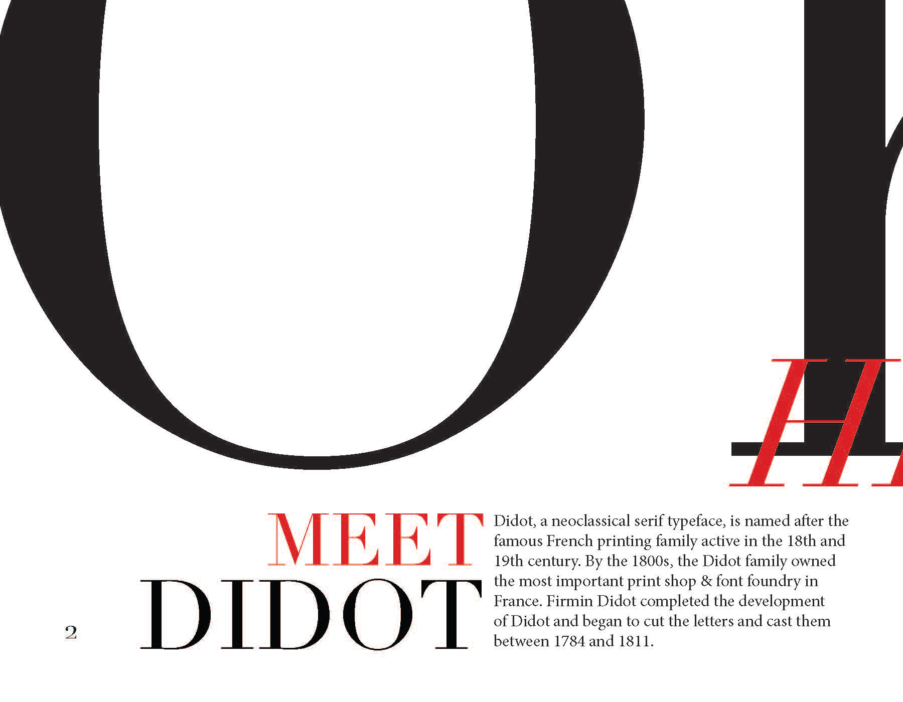
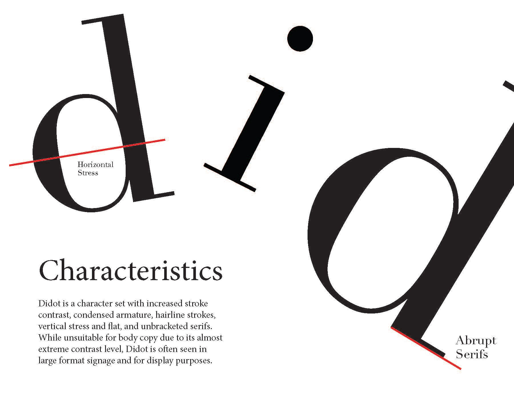
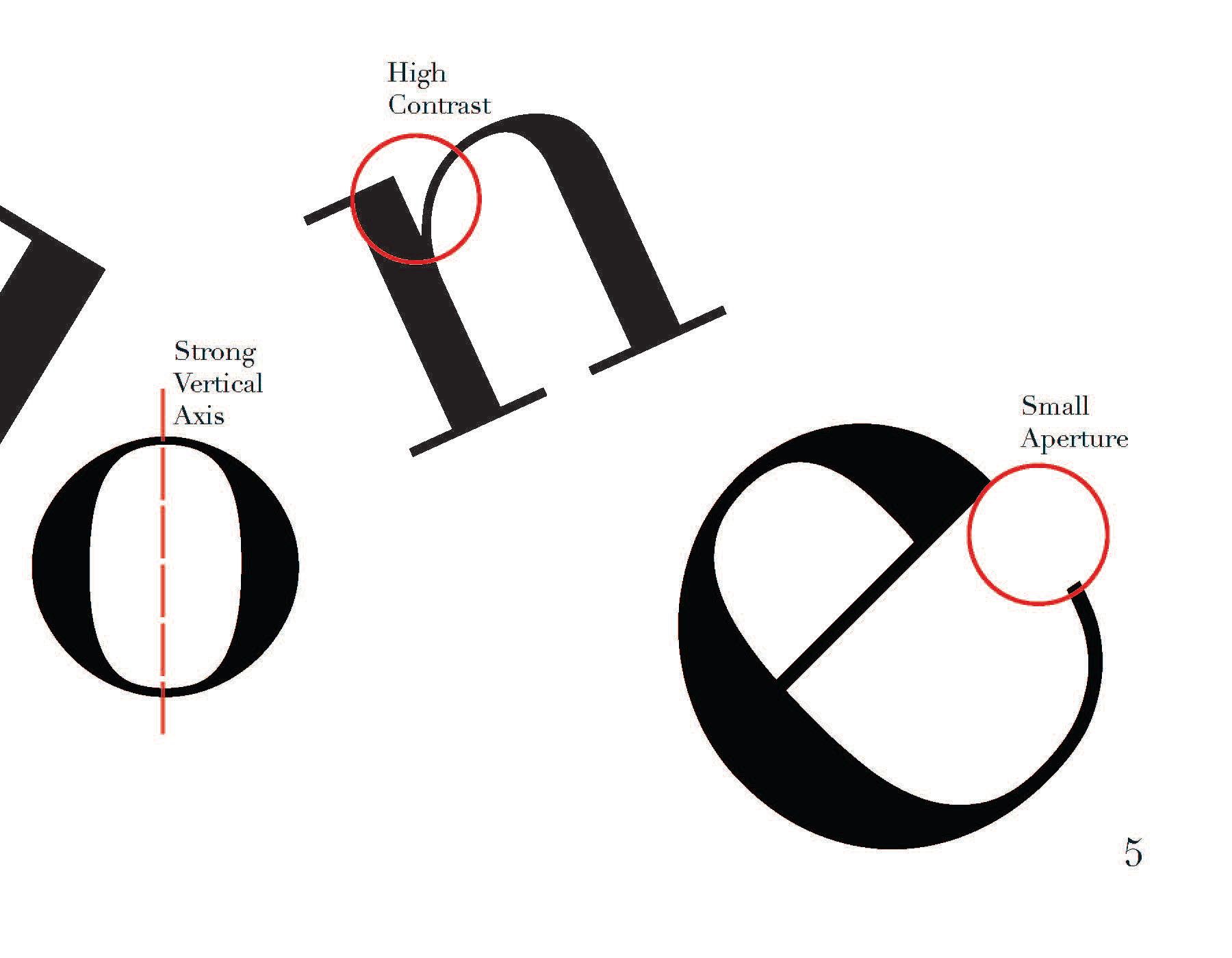
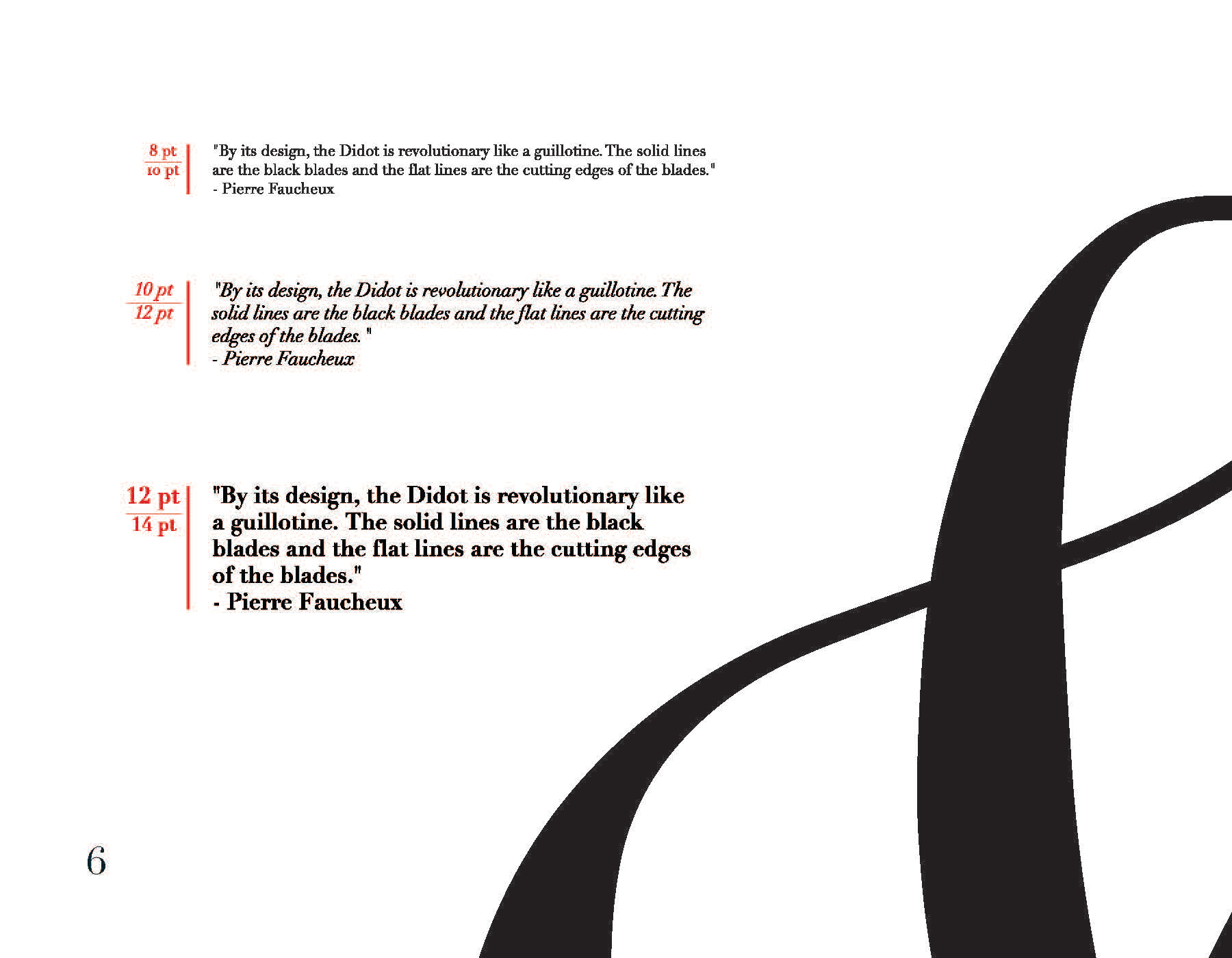
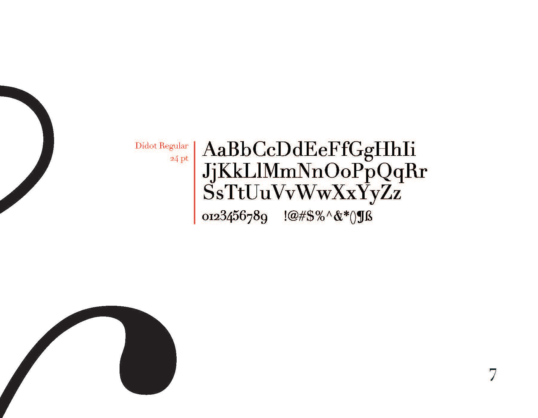
Highlighting the Typeface's Features: The book layout was carefully structured to emphasize Didot's signature characteristics, like its sharp contrasts and high contrast between thick and thin strokes.
Cohesive Layout: The layout was designed to be clean and streamlined, ensuring the book feels refined while maintaining legibility and ease of navigation.
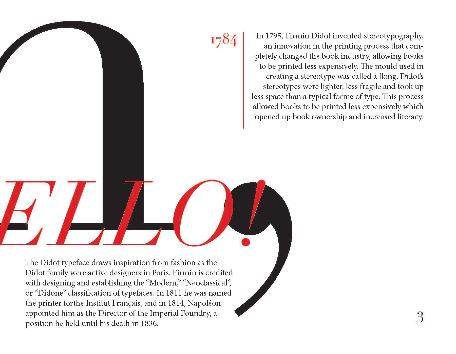
Didot’s History: I chose to incorporate elements of Didot’s history and influence to show the depth of the typeface’s legacy and its enduring impact on typography and design.