Brand Development | Business Collateral
Team project with Annika Monfort, Emily Starkweather, and Paula Ribera:
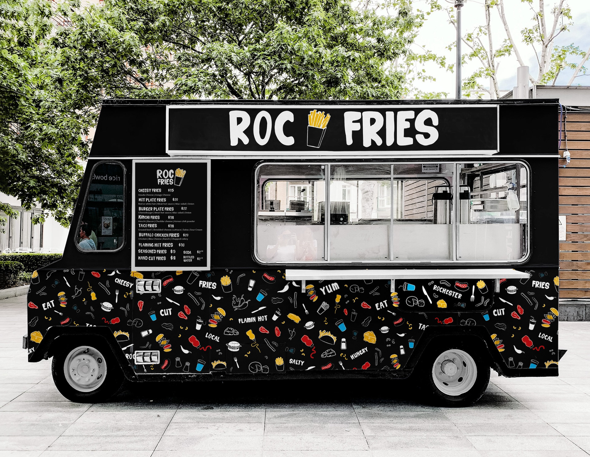
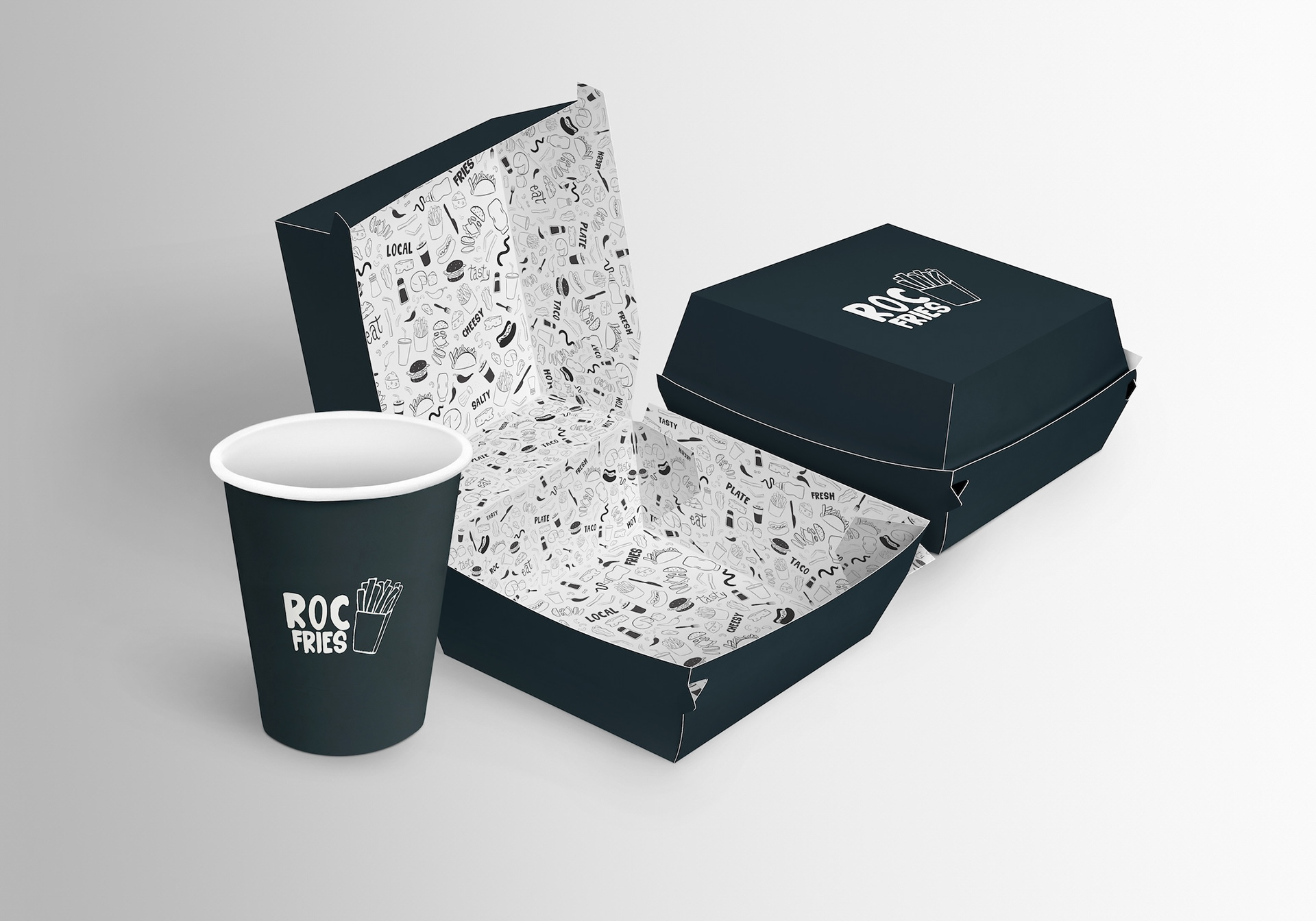
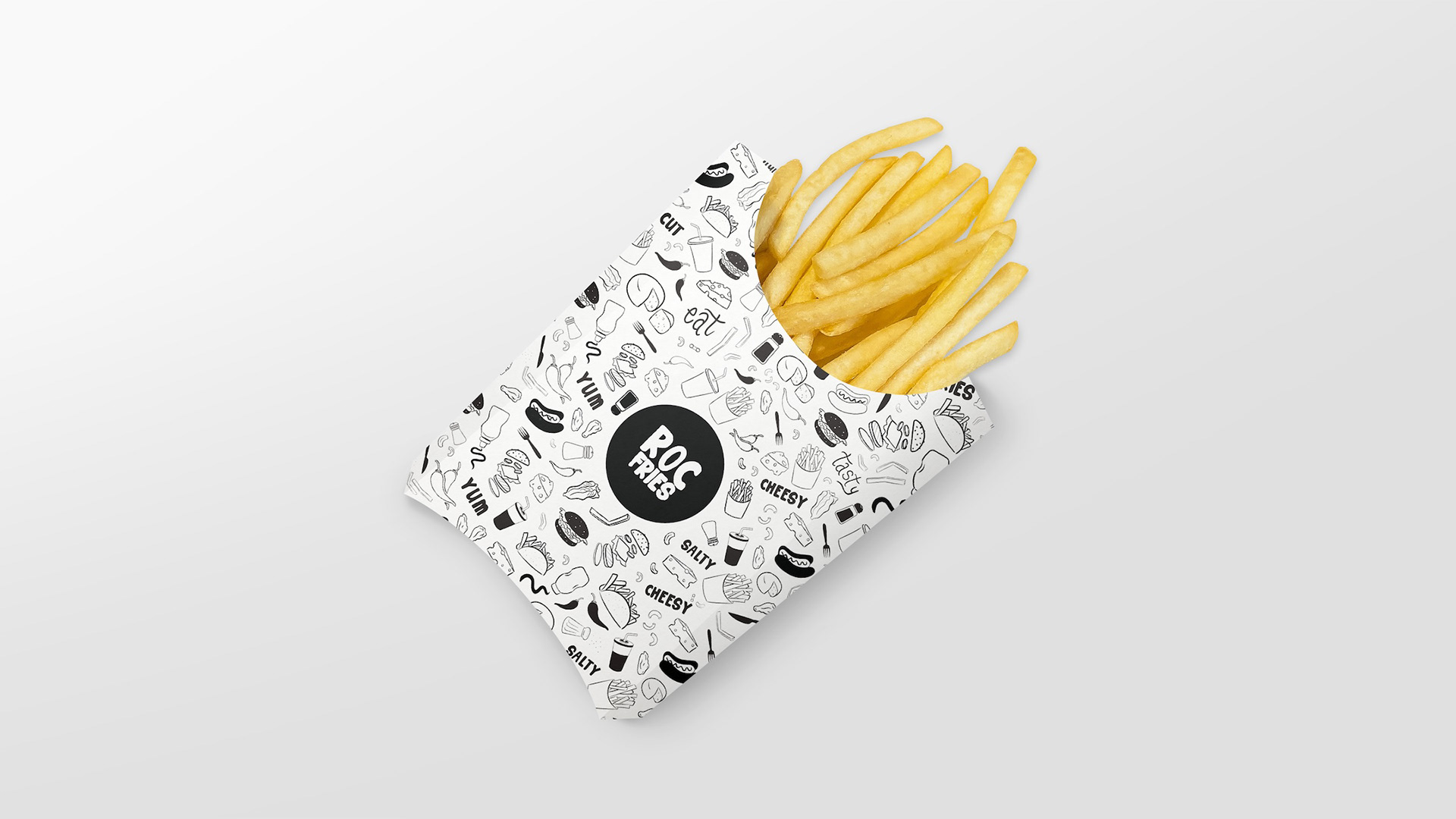
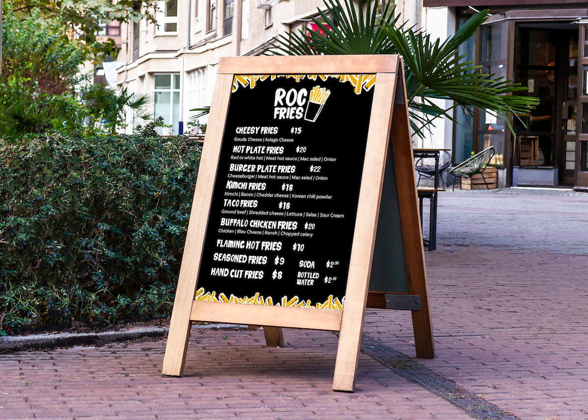
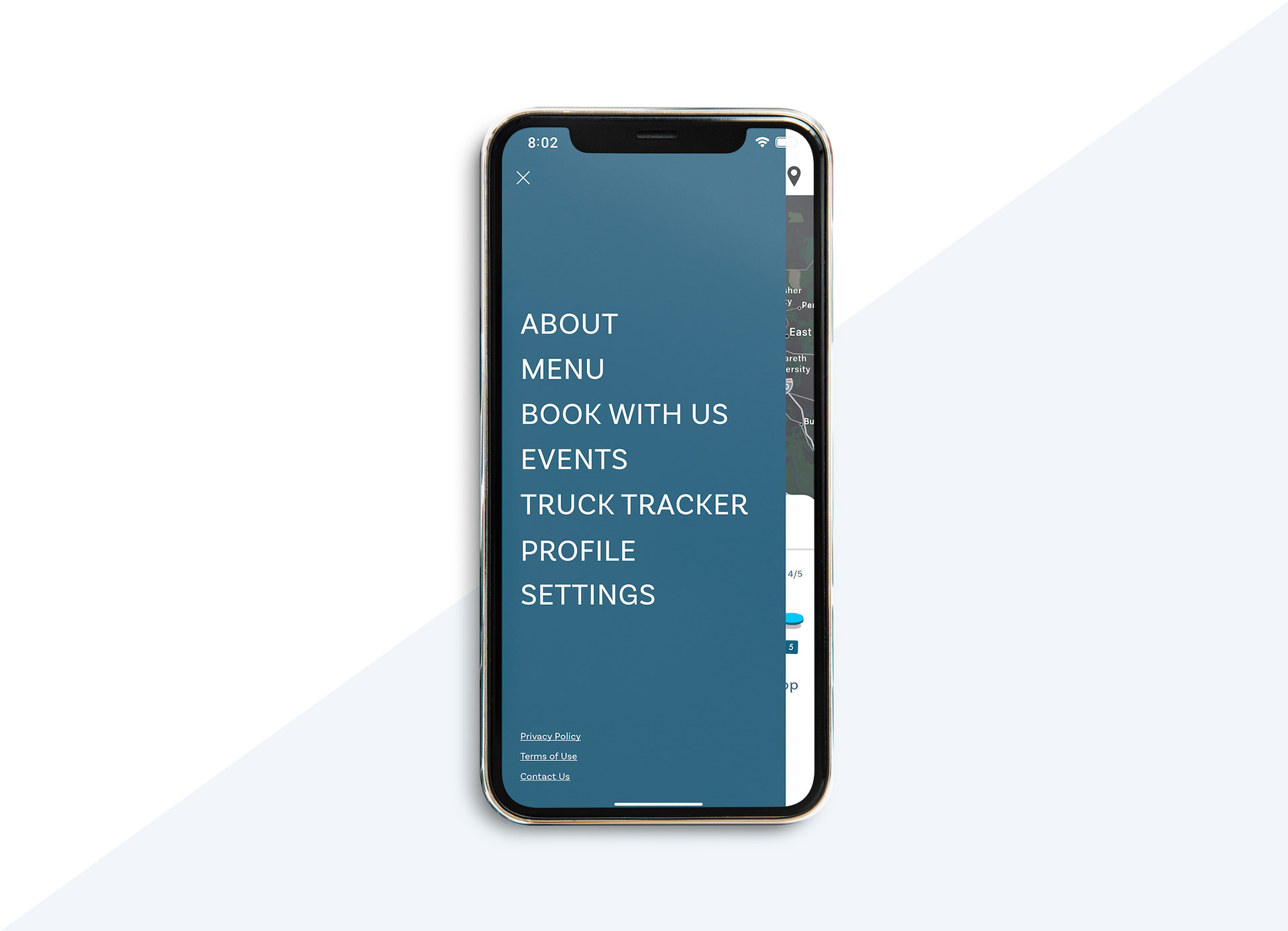
Roc Fries is a food truck based in Rochester, NY, serving a variety of delicious fries. To create a playful and engaging brand image, I worked with my team to develop a vibrant, fun design using primary colors and illustrative patterns. We designed a custom typeface for the logo and menu items, bringing a unique, lively style to the brand. The truck itself was designed to resemble a blackboard, with chalk-like illustrations of the menu items, capturing the energetic spirit of Rochester.
Creative Process – What is your reasoning behind these design choices?
Simple Logo: I kept the logo simple, landing on a fries box to clearly convey what the food truck is selling, ensuring it’s instantly recognizable.
Chalk-Like Style: To keep the brand playful and engaging, I used a chalk-like style for the illustrations, each inspired by Roc Fries' menu items, creating a fun and relatable visual.
Campaigns to Promote the Truck: I developed multiple campaigns to generate excitement and engagement:
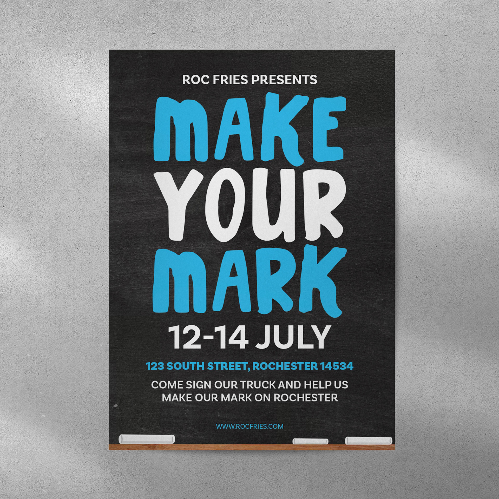
Make Your Mark: Inviting customers to sign a part of the truck after purchasing fries, fostering a sense of community and connection.
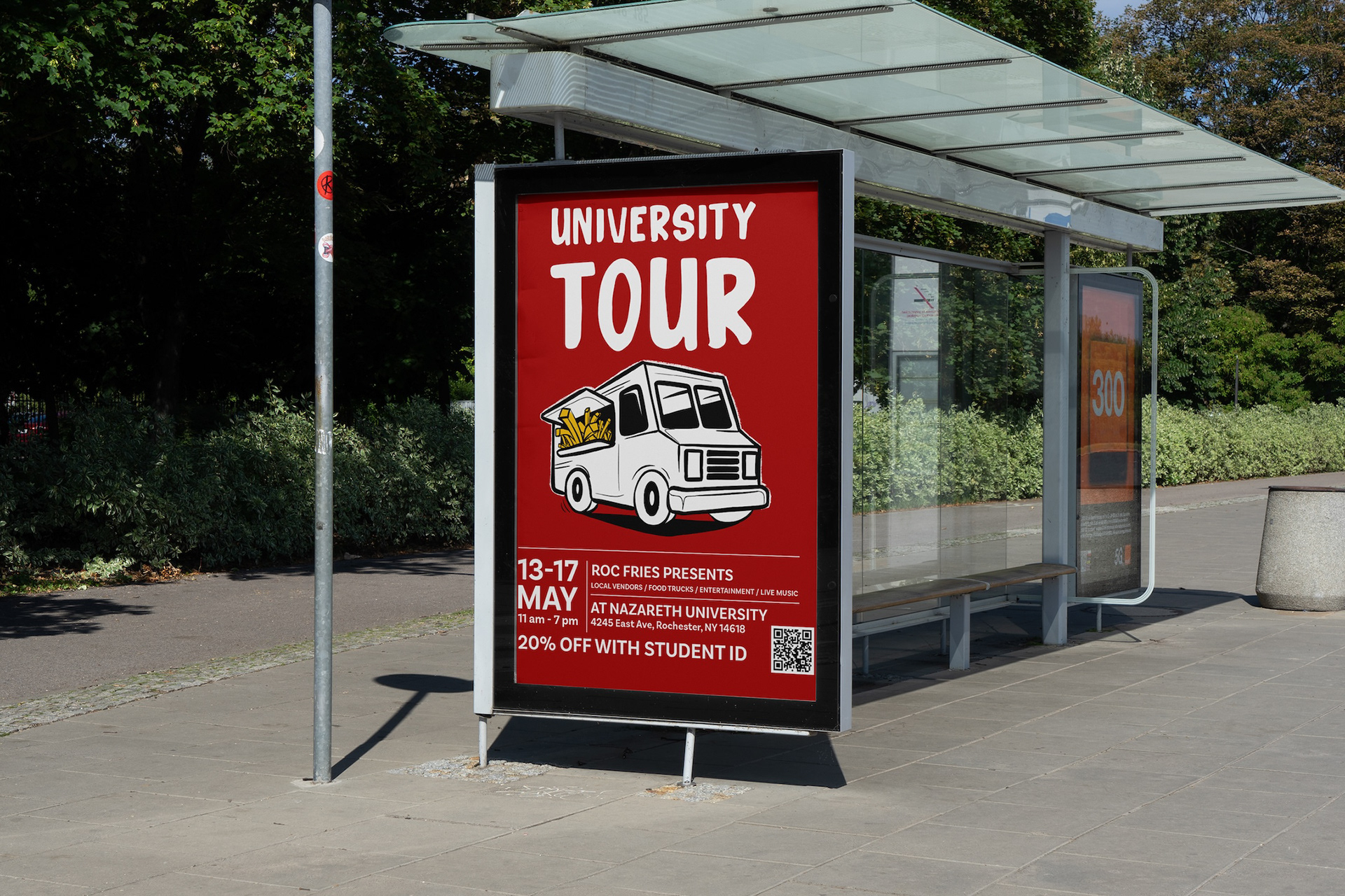
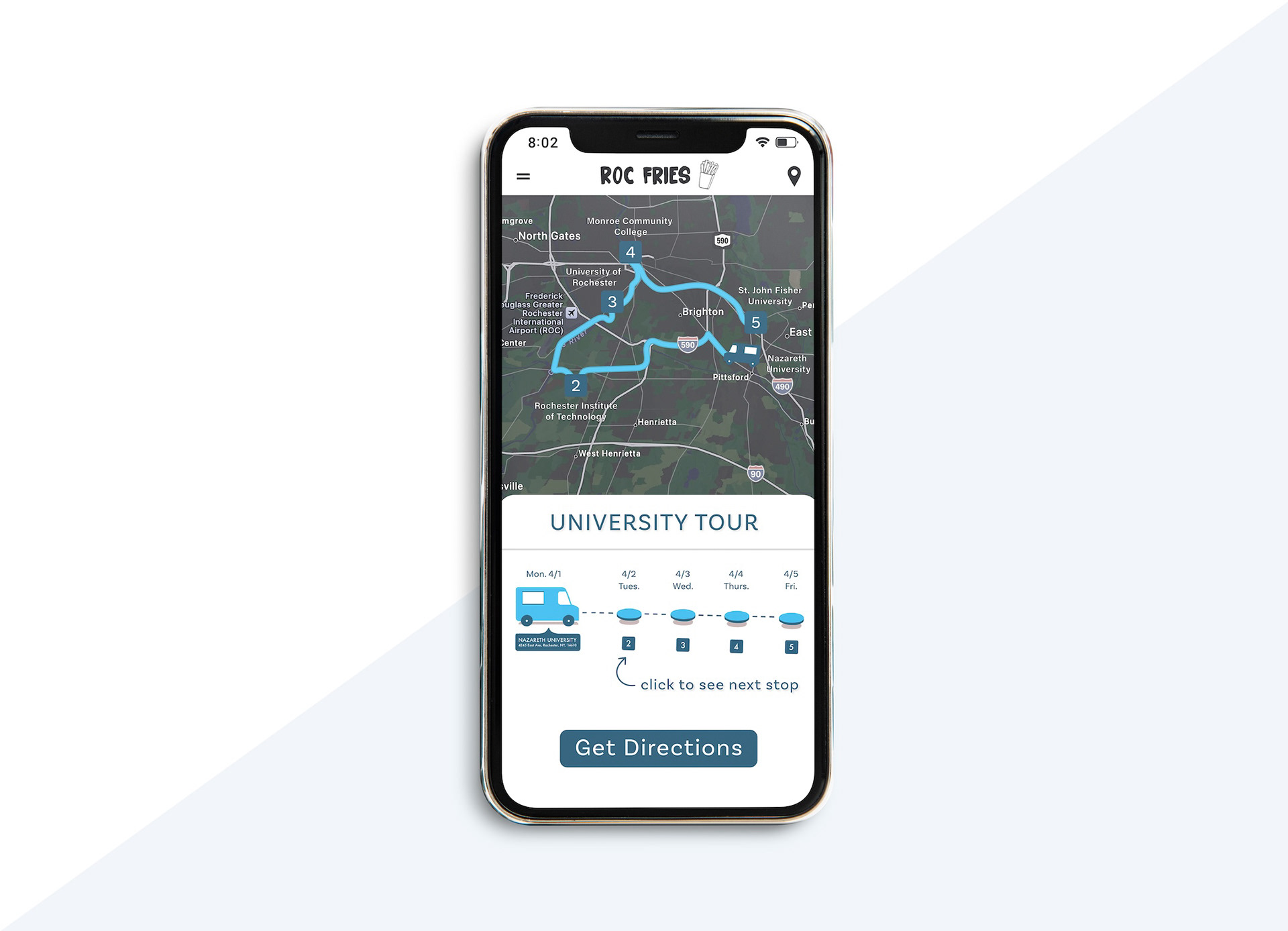
University Tour: Targeting college students by traveling to a different university each day, bringing the food truck to students’ doorsteps.
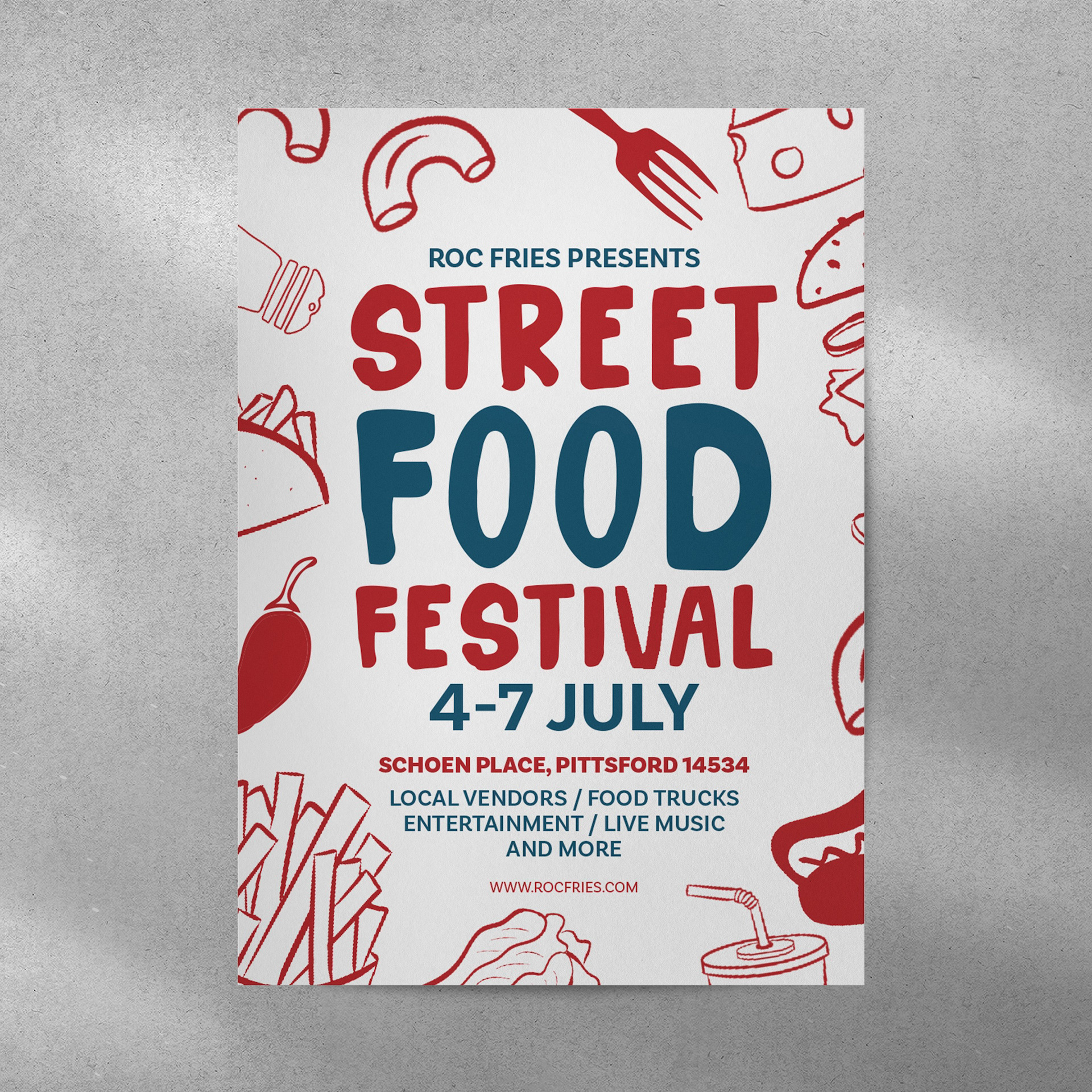
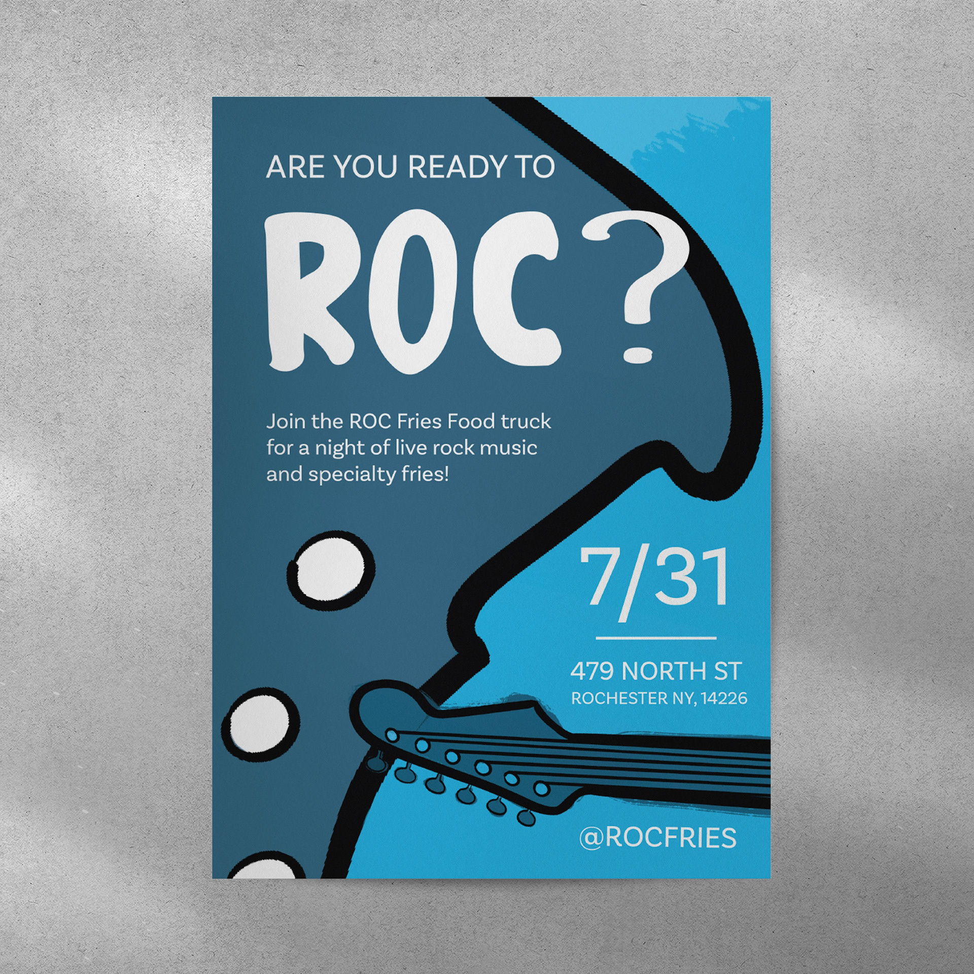
Street Food Festival: Promoting a local festival featuring food, live music, and vendors, giving Roc Fries exposure in the local food scene.
Bold Color Pairing: While red is a common color in fast food branding, I used a combination of red, yellow, and blue for a fresh, dynamic twist that still maintains a bold and vibrant aesthetic.
Collaboration: Worked effectively with a team of four, maintaining strong communication and teamwork to successfully bring the brand vision to life.
What I Worked On:
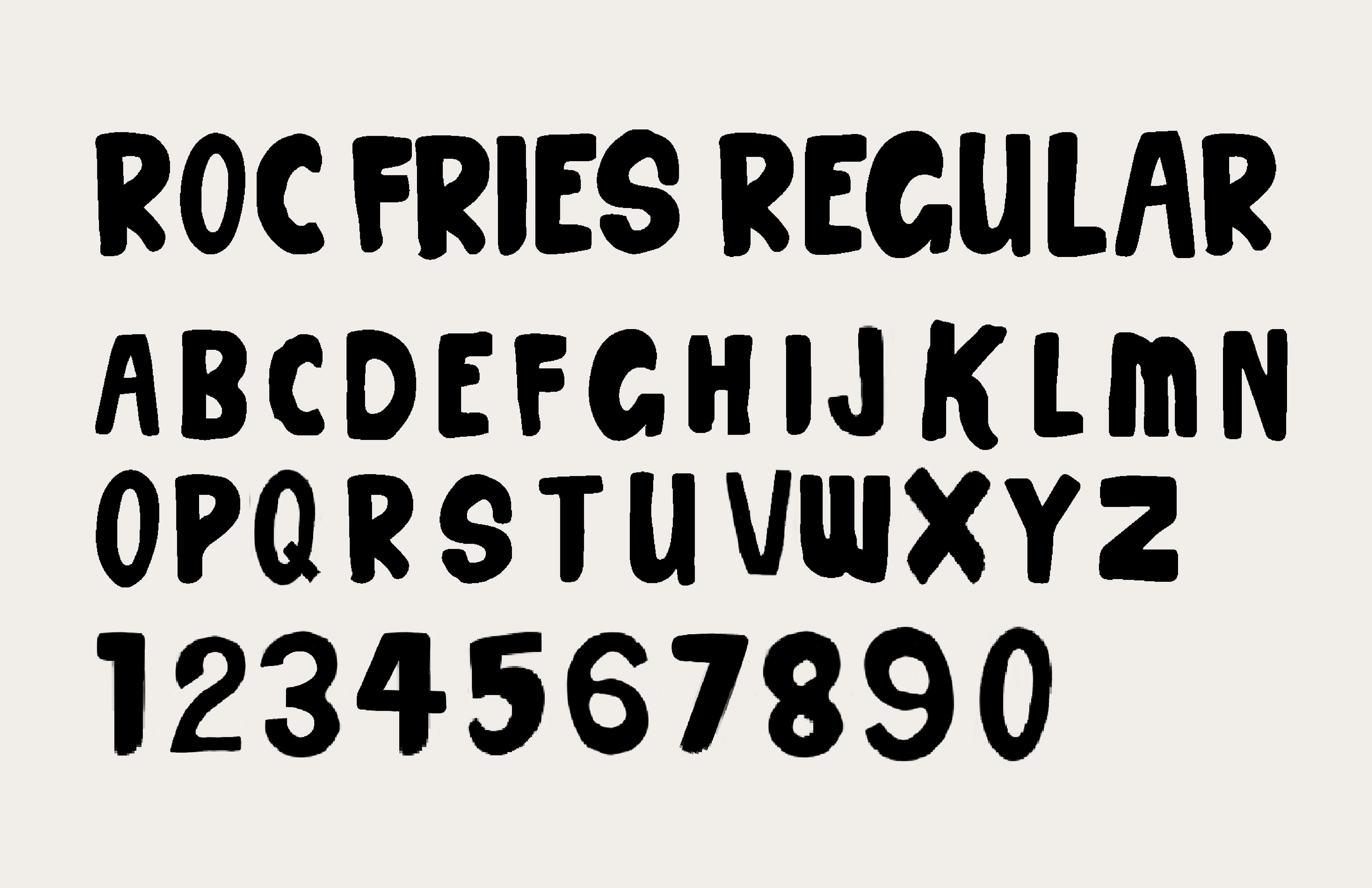
For ROC Fries, I led the design of the custom typeface, which became a key element of the branding. I also guided the development of the illustrative patterns and designed three key posters: Make Your Mark, Street Food Festival, and University Tour. Each poster captures the vibrant, energetic street-food vibe of the brand and promotes local events in a bold, eye-catching way.
For ROC Fries, I led the design of the custom typeface, which became a key element of the branding. I also guided the development of the illustrative patterns and designed three key posters: Make Your Mark, Street Food Festival, and University Tour. Each poster captures the vibrant, energetic street-food vibe of the brand and promotes local events in a bold, eye-catching way.